Baran Shajari
Human–AI Research & UX/UI Design
Toronto, Canada
Year
2024
Role
UX/UI Desginer
Timeline
2024
Team
Independent project
METHODS & Tools
Balsamiq, Figma, Wix
Project Link
Overview
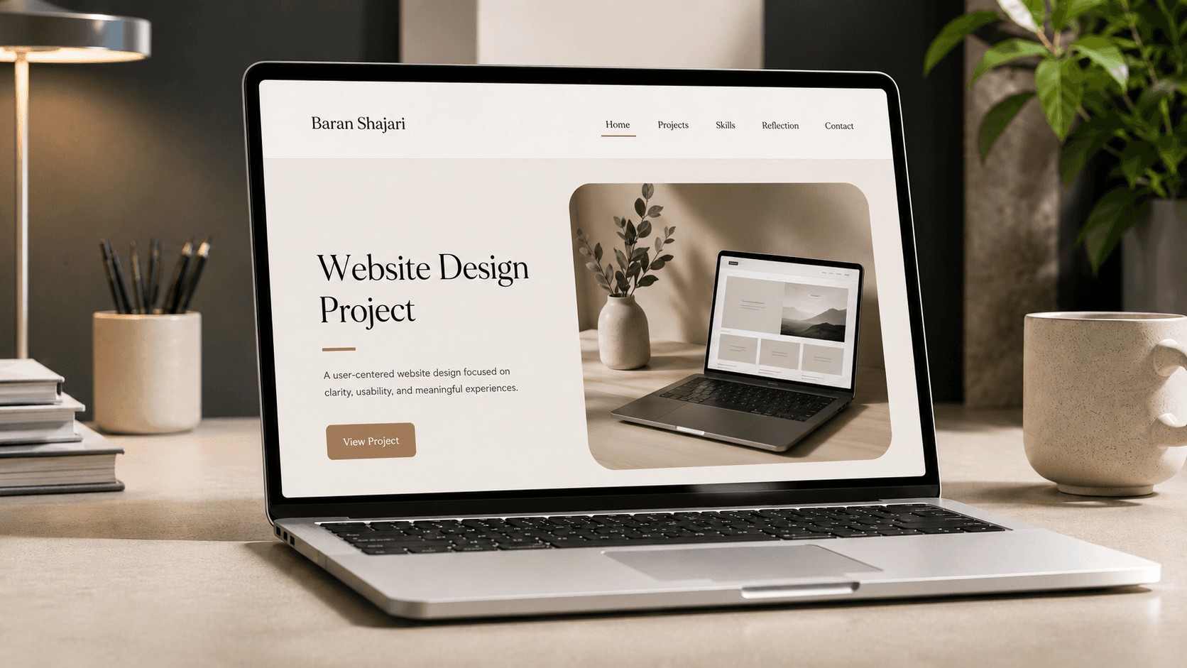
The goal of this porject was to bring together several types of content, including research projects, technical writing, skills, reflections inside one coherent website.
The final website included a homepage, projects section, skills page, reflection page, and contact page. It marked the beginning of my interest in user-centred design and in making complex information more understandable through structure and visual hierarchy.

Problem
Class projects were scattered across different places
My academic work existed across course submissions, research files, written reflections, and separate project materials. Without one central space, it was difficult to keep track of the work, understand how projects connected, or see how my skills developed over time.
The design needed to solve several problems:
organizing multiple projects without overwhelming users;
creating a predictable navigation system;
separating academic writing into scannable sections;
maintaining visual consistency across pages;
making long text easier to read;
showing progression from early work to later projects.

Design Challenge
How might we organize scattered academic work so users can
easily find, understand, and navigate different projects?
Process
01

01 · Organizing the content
I grouped related material into clear site sections.
02

02 · Creating the navigation
I designed a navigation system connecting the homepage, projects, skills, reflections, and contact content.
03

03 · Designing page hierarchy
I used headings, subheadings, shorter paragraphs, and spacing to make longer academic content easier to scan.
04

04 · Writing for the web
I simplified language, divided content into sections, and highlighted key information for a digital reading experience.
05
05 · Building in Wix
I assembled the pages, navigation, imagery, and text inside Wix and adjusted layouts to create a consistent experience.
06

06 · Testing and refining
I used peer feedback and usability testing to improve navigation labels, whitespace, headings, readability, and consistency.
07

07 · Reflecting on the outcome
I compared the final site with earlier assignments and identified how my research, writing, and design decisions improved throughout the project.
I created a multi-page academic portfolio with clear navigation, consistent page structure, and organized project content.
The final website used:
grouped project pages
clear headings and subheadings
shorter text sections
visual separation between topics
a dedicated skills page
a reflection section
and a consistent navigation pattern
The design brought separate assignments into one connected experience and made the progression of my work easier to understand.

Results
The completed website successfully presented my academic projects, research skills, writing development, and reflections in one accessible location.
The project improved my ability to organize information, write for digital audiences, respond to feedback, and design clear navigation. It also became an early foundation for my later work in UX research, interface design, and human-centred technology.
Reflection & Impact
This project introduced me to user-centred web design. I learned how navigation, hierarchy, whitespace, and concise writing can make complex content easier to understand. It also taught me to use feedback as part of the design process rather than treating the first version as final.